
Contrast Ratios: Why They Actually Matter
Learn how WCAG standards ensure your designs are readable for everyone. We break down the math behind contrast and show you practical ways to test.
Read MoreMaster the techniques for creating icons that shine in both dark and light interfaces. We’ll explore contrast ratios, stroke weights, and color systems that work seamlessly across dual themes.
You’ve probably noticed it before — an icon that looks crisp and clear on a dark background becomes muddy and hard to read on white. That’s not a design flaw, it’s a design challenge most teams don’t handle properly. Icons aren’t just graphics that can flip colors and call it a day. They’re interface elements with specific requirements for clarity, visual weight, and usability across different contexts.
The real issue: most designers create one icon and swap the color. But proper icon adaptation requires understanding stroke contrast, optical adjustments, and how different backgrounds affect perception. This guide walks you through the actual process used by professional design systems at scale.
WCAG standards demand specific contrast ratios. For icons, you’re looking at different requirements than body text.
Most UI icons need at least 4.5:1 contrast ratio against their background. This means if you’re using #333333 on white, you’ve got your baseline. Don’t cut corners here — users with visual impairments rely on this clarity.
Bigger icons can work with slightly lower contrast. A 64px icon at 3:1 ratio still reads clearly because size adds readability. This gives you more flexibility with colors if you’re designing brand-heavy interfaces.
Error states, warnings, and safety-related icons? Go for 7:1 contrast. These are the icons people need to spot instantly in stressful moments. There’s no room for ambiguity with delete buttons or alert symbols.
Here’s where most teams mess up. They think icon adaptation means “invert the color.” But there’s actual technique involved.
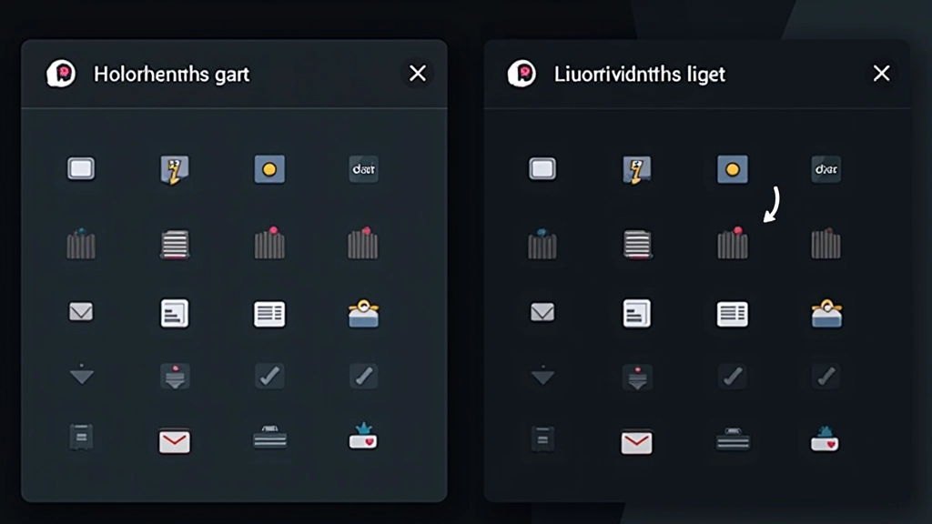
Dark backgrounds make icons appear heavier visually. Your 2px stroke on white might need to drop to 1.5px on dark. Why? It’s optical illusion — the stroke sits on a dark field and looks thicker because of contrast. Test at actual sizes, not zoomed in. At 24px, you’ll notice the difference immediately.
Don’t just invert. If your light theme uses #1F2937 (dark gray), the dark theme shouldn’t use #E5E7EB (light gray). That’s mathematically inverse but visually wrong. Instead, test colors on actual dark backgrounds — use #F3F4F6 or even #FFFFFF depending on the background darkness. The goal isn’t mathematical inversion; it’s visual balance.
Professional design systems don’t create separate color palettes. They create one system that works in both contexts.
Name colors by purpose, not appearance. Use “icon-primary,” “icon-secondary,” “icon-success” instead of “dark-gray” or “light-blue.” This way, when you flip themes, the semantic meaning stays the same. The icon-success token automatically pulls the right shade for the current theme.
Set up tokens with light and dark variants baked in. Your design tool (Figma, Adobe XD, or similar) should let you define a token like “icon/primary” with a light value and a dark value. When you toggle themes, tokens automatically swap. This scales across hundreds of icons without manual work.
Every token combination must pass contrast checks. Run your token pairs through a WCAG contrast checker. Document which combinations meet AA and which meet AAA. This becomes your design system’s baseline — designers can’t pick random colors because tokens enforce compliance.
Theory is one thing. Actually testing your icons is where real problems surface.
Don’t review at 200% zoom. Export your icons at actual sizes — 16px, 24px, 32px, 48px — and view them in context. A 2px stroke looks fine at 200% but might disappear at 16px. Use actual UI mockups, not isolated icon displays. See how your icons interact with text, buttons, and other interface elements.
Run every icon through a contrast checker. Tools like Stark, Color Oracle, or WebAIM’s checker catch problems instantly. Test on multiple backgrounds too — your dark theme might have several gray levels, and you need to ensure icons work on all of them.
What looks perfect on your desktop monitor might look terrible on an iPhone. Pull your design onto actual devices and review in different lighting conditions. A bright room shows different contrast than evening use. This catches optical issues your monitor won’t reveal.
Moving from design to code introduces its own challenges.
SVGs are your friend here. They scale infinitely and let you control colors via CSS or HTML attributes. A PNG icon that looks crisp at 24px becomes blurry at 32px. Use SVGs with proper viewBox attributes, and you’ll handle every size cleanly. If you must use PNGs, export at 2x resolution minimum.
Define icon colors as CSS custom properties. Your light theme might set –icon-primary to #1F2937, and dark theme sets it to #F3F4F6. SVGs reference these variables, and theme switching updates all icons instantly. No manual color swaps, no JavaScript needed for simple toggles.
Each icon file matters. If you’re shipping 200 icons as individual SVGs, that’s overhead. Consider icon systems like Font Awesome or custom SVG sprites that bundle icons efficiently. Your design system should define which approach your team uses — consistency matters more than perfect optimization.
Icon adaptation isn’t about doing twice the work. It’s about understanding the fundamentals once and building systems that handle both themes automatically. When you nail your contrast ratios, establish semantic color tokens, and test rigorously at real sizes, theme switching becomes seamless for users.
The designers at Figma, Apple, and Google didn’t succeed by inverting colors. They succeeded by thinking systematically about how visual weight changes across backgrounds, how perception shifts in different lighting, and how to build processes that scale. That’s the approach we’ve walked through here.
Start with your contrast requirements. Build your color tokens next. Test obsessively. Document everything. Your future self — and your entire design team — will thank you when you’re shipping dark and light themes without the chaos.
This guide covers general best practices for icon design across themes. Design requirements vary significantly by industry, accessibility standards, and specific use cases. Always test with real users and verify compliance with your target accessibility standards (WCAG 2.1 AA is a common baseline, but AAA is recommended for critical interfaces). Standards and best practices evolve — check current WCAG guidelines and design system documentation for the most up-to-date requirements.
Continue exploring dark and light theme design
Learn how WCAG standards ensure your designs are readable for everyone. We break down the math behind contrast and show you practical ways to test.
Read More
The switch that lets users choose between themes matters more than you think. We’ll cover toggle patterns that actually work and avoid common UX pitfalls.
Read More
Building one color system that works across themes is the foundation of scalable design. We’ll show you how to structure tokens and avoid the chaos of multiple palettes.
Read More