Contrast Ratios: Why They Actually Matter
Learn how WCAG standards ensure your designs are readable for everyone. We break down the math and show you practical tools to check your work.

Why This Matters Right Now
You’ve probably heard “make it accessible” before. But contrast ratios aren’t some checkbox item on a design task list. They’re actually the foundation of readable design. When you get contrast right, your interface works better for literally everyone — not just people with vision issues.
Here’s the thing: roughly 1 in 4 adults struggle with vision in some way. That’s a huge number. And beyond medical vision impairments, we’re all working in bright sunlight, tired at 11 PM, or squinting at our phones. Good contrast ratios make your design work in all those moments.
The Math Behind Contrast
Contrast ratio is actually pretty simple math. You take the lighter color’s brightness and divide it by the darker color’s brightness. That’s it.
The formula:
(L1 + 0.05) / (L2 + 0.05)
Where L is the relative luminance. Don’t worry, you won’t calculate this by hand.
The result’s a ratio. Like 4.5:1 or 7:1. Higher numbers mean stronger contrast. WCAG gives you targets to hit depending on the text size and importance.
- AA (Standard): 4.5:1 for regular text, 3:1 for large text
- AAA (Enhanced): 7:1 for regular text, 4.5:1 for large text

WCAG Compliance Levels Explained
Level AA
The baseline. This is what most sites aim for. It covers the vast majority of accessibility needs and doesn’t require extreme color choices.
Minimum Ratios:
4.5:1 (normal text)
3:1 (large text)
Level AAA
Enhanced protection. Use this for critical content, medical interfaces, or when your audience includes older users. It’s stricter but still achievable.
Minimum Ratios:
7:1 (normal text)
4.5:1 (large text)
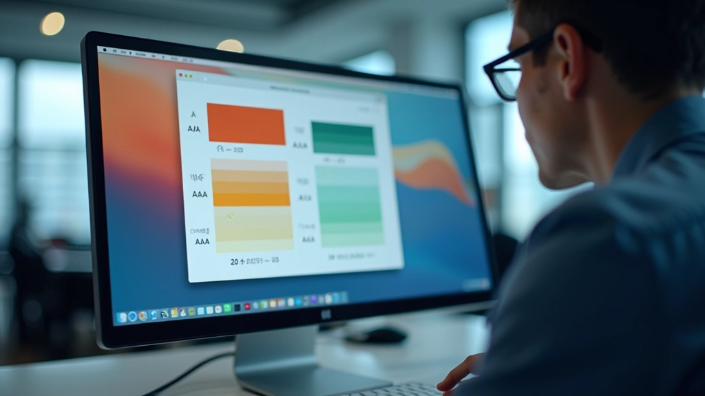
Practical Techniques for Testing
You don’t need to memorize ratios or calculate them manually. Tools handle this. But understanding what you’re looking at matters.
Step-by-Step Testing Process
Pick Your Tool
Use WebAIM’s contrast checker or a browser extension. They’re free and work instantly.
Input Your Colors
Paste the foreground and background hex codes. The tool calculates the ratio instantly.
Check Against Standards
The tool shows you if you pass AA, AAA, or neither. Adjust colors if needed and retest.
Test Real Scenarios
Check text on buttons, backgrounds, hover states. Don’t just test the happy path.
Essential Tools to Keep Handy
WebAIM Contrast Checker
Web-based. Enter hex codes. Get instant results. It’s the gold standard for quick checks.
Browser Extensions
Chrome and Firefox have extensions that check contrast right on any webpage you’re viewing. Helpful for auditing live sites.
Figma Plugins
If you design in Figma, use contrast plugins to check before you export. Catches issues early.
Vision Simulators
Tools like Color Oracle simulate color blindness. See how your design looks to people with different vision types.
Real-World Examples Matter
Let’s get specific. Light gray text (#999999) on white background? That’s only 5.4:1. Passes AA for large text, fails for normal text. Looks fine on your monitor, but put it on a phone in sunlight and it disappears.
“Good contrast isn’t just accessibility. It’s good design. Period.”
— Web accessibility principle
Switch that gray to #767676 and you’re at 7.1:1. Now it works everywhere. And honestly, it looks better. The text is more readable. Your interface feels more polished.
Dark Mode and Light Mode Challenges
This gets tricky when you’re building dual-theme interfaces. A color that works in light mode might fail in dark mode. You can’t just invert your palette.
Here’s what actually works: test both themes independently. Don’t assume if it passes in light mode, it’ll pass in dark. Sometimes you need slightly different hex values for each theme to maintain the same visual weight while hitting contrast targets.
Light Theme
Dark text (#1a1a1a) on light background (#ffffff): 18.5:1
Maximum contrast. Safe and readable.
Dark Theme
Light text (#f1f5f9) on dark background (#0f172a): 14.8:1
Still excellent contrast. Protects eyes at night.

Common Mistakes to Avoid
1. Forgetting Hover and Focus States
Your link color works on the main background. But what about when someone hovers? Or when it’s in a button with a colored background? Test those too.
2. Ignoring Disabled States
Disabled buttons are often light gray on gray. That’s usually terrible contrast. Make it obvious the button is disabled while keeping it readable.
3. Testing Only Perfect Conditions
Your design looks great on your monitor in a dark room. Test it on different devices, in bright light, on older screens. That’s the real test.
4. Relying on Color Alone
Don’t use red to mean error and green to mean success. Add icons or text. People with color blindness won’t see the difference otherwise.
Key Takeaways
- Contrast ratio is the brightness difference between two colors. Higher is better.
- WCAG AA (4.5:1) is the standard. AAA (7:1) is enhanced protection.
- Use tools — WebAIM, browser extensions, Figma plugins. Don’t calculate by hand.
- Test dark mode and light mode separately. They need different color values sometimes.
- Check hover, focus, and disabled states. Not just the default state.
- Good contrast benefits everyone. Bright sunlight, tired eyes, older screens — it all gets easier.
Ready to Check Your Design?
Pick one color pair from your current project and run it through WebAIM. You’ll see immediately if you’re passing or failing. That’s where learning actually starts.
Explore Related TopicsImportant Note
This article provides educational information about WCAG contrast ratio standards and accessibility best practices. While we’ve aimed for accuracy, accessibility standards evolve and differ by jurisdiction. For official compliance requirements or legal guidance, consult the Web Content Accessibility Guidelines (WCAG) 2.1 documentation directly or work with accessibility specialists. Tools mentioned are accurate as of March 2026 but may change.
Related Articles
