Color Systems for Dual-Theme Interfaces
Master semantic color palettes, contrast ratios, and theme switching that actually works across dark and light modes. Building interfaces that look great everywhere requires more than just inverting colors.
Why Your Current Color System Probably Isn’t Working
Here’s the thing — most designers start by taking their light theme colors and making them lighter for dark mode. That’s backwards. You’ll end up with gray text on gray backgrounds or colors that look completely different between modes. We’ve all seen it.
A real dual-theme color system needs semantic tokens. Instead of thinking “primary blue” and “primary blue darker,” you’re thinking about what each color *does* — is it background, text, a status indicator, an accent? Once you separate intent from appearance, building for dark and light becomes systematic instead of guesswork.
The best part? When you get this right, your design system actually scales. Adding a third theme (high contrast mode) or supporting brand variants becomes manageable instead of chaotic.


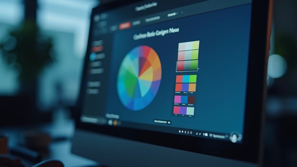
Building Semantic Color Tokens
Semantic tokens are named by function, not appearance. Instead of `color-blue-600`, you’d use `color-background-primary`, `color-text-secondary`, or `color-border-interactive`. This layer of abstraction is what makes dual themes actually manageable.
Your token structure typically looks like this:
What makes this work is that *the same token name* points to different hex values in light vs. dark mode. Light mode: `color-text-primary` = #0f172a. Dark mode: `color-text-primary` = #f1f5f9. Your code doesn’t change — just the values flip.
Contrast Ratios: The Non-Negotiable Part
WCAG AA requires 4.5:1 for normal text, 3:1 for large text. WCAG AAA (the gold standard) requires 7:1 and 4.5:1 respectively. You’ll want at least AA compliance, preferably AAA for critical UI.
This is where most dual-theme systems fail. Designers eyeball it. “That looks readable to me” isn’t good enough when you’ve got two completely different backgrounds. Use a contrast checker — WebAIM’s tool is free and reliable.
The math: contrast ratio = (L1 + 0.05) / (L2 + 0.05), where L is the relative luminance of the lighter color. Don’t memorize the formula — just test everything. Your light mode text on light mode background needs its own check. Your dark mode text on dark mode background needs a separate check. They won’t be symmetrical.
A practical approach: create a contrast matrix. Map every text color against every background it might appear on. You’ll quickly spot where you need to adjust. In dark mode, you might need slightly lighter text than you’d think. In light mode, slightly darker.
Icons That Work in Both Themes
Icons aren’t just smaller versions of your color system. They’ve got their own rules. An icon that’s fine at 24px might disappear at 16px in dark mode if you’re not careful with weight and spacing.
Start with consistent stroke weight — usually 1.5px to 2px for standard density. Test at the actual sizes you’ll use. A 16px icon in light mode with #0f172a foreground looks crisp. The same icon in dark mode with #f1f5f9 foreground sometimes feels thinner because of how your eye perceives brightness.
The practical fix: either slightly increase stroke weight in dark mode (1.75px instead of 1.5px) or use optical adjustments. Some teams create two versions of their icon set. Others use CSS filters to add subtle weight. Both work — pick whatever fits your workflow.
Don’t forget about disabled/inactive states. An icon at 50% opacity in light mode looks fine. The same opacity in dark mode sometimes becomes illegible. You’ll probably need different opacity values per theme.
Implementing the Theme Toggle
The toggle itself matters more than you’d think. It needs to be discoverable but not intrusive. Most teams put it in the top-right corner, header area, or settings. Don’t hide it in a menu three levels deep.
Use a clear icon — usually a sun for light mode, moon for dark mode. The important part: show which mode is currently *active*, not which mode the toggle will switch to. A filled moon means “you’re in dark mode.” An outlined moon means “switch to dark mode.”
On the technical side, you’ve got two main approaches:
Pro tip: respect the user’s system preference using `prefers-color-scheme`. Default to whatever their OS is set to, then let them override it manually. Store their preference in localStorage so it persists across sessions.
The Implementation Checklist
Define your semantic tokens
Map out every color role: backgrounds, text, borders, interactive states. Name them functionally, not aesthetically.
Create light mode palette
Start with your primary brand color. Generate supporting colors (backgrounds, text, borders). Test every combination for contrast.
Build dark mode independently
Don’t invert. Design dark mode as its own complete system. Your dark mode backgrounds might not be pure black — often #0f172a or #1a202c works better.
Test contrast systematically
Use WCAG AA as minimum. Create a contrast matrix. Every text color against every background. Document your findings.
Adapt icons and images
Test icons at actual sizes in both modes. Adjust stroke weight, opacity values, or create theme-specific versions if needed.
Implement theme toggle
Use CSS variables + data attribute. Respect system preference. Store user choice. Test for flash of unstyled content.
Key Takeaways
Semantic > Aesthetic
Name your colors by function (background-primary, text-secondary) instead of appearance (blue-600). This abstraction layer makes dual themes possible.
Don’t Invert
Dark mode isn’t just “light mode but darker.” Design it as a complete system with its own color relationships and constraints.
Test Everything
Contrast ratios aren’t optional. Use tools. Create matrices. Test at actual viewport sizes. What looks fine in Figma might fail in production.
Icons Need Attention
Icons don’t scale proportionally between themes. You’ll probably need weight adjustments, opacity tweaks, or theme-specific versions.
Disclaimer
This article provides educational information about design systems and color theory best practices. WCAG guidelines are standards, not guarantees — accessibility requirements vary by region and context. Always test your implementations with real users and assistive technology. This information is current as of March 2026 and reflects industry consensus, but specific recommendations may evolve as design tools and accessibility standards develop.

