
Contrast Ratios: Why They Actually Matter
Learn how WCAG standards ensure your designs are readable for everyone. We break down the math, testing tools, and common mistakes.
Read ArticleMaster the design patterns that make dark mode and light mode switches work seamlessly across interfaces. We’ll walk through contrast management, user preferences, and the technical considerations that separate good toggles from great ones.

Users don’t just want theme choices — they want them to work flawlessly. A toggle that switches between dark and light modes isn’t just a convenience feature. It’s a fundamental accessibility tool that affects readability, battery life on OLED screens, and overall user satisfaction. We’ve tested dozens of implementations, and the difference between a mediocre toggle and an excellent one comes down to understanding how color systems, contrast ratios, and user preferences interact.
The challenge? It’s not just about swapping two color palettes. You’re managing icon adaptations, ensuring WCAG compliance across both modes, preserving user preferences, and handling edge cases that most designers overlook. That’s what we’re covering here — the real work behind making toggles that users actually trust.


Here’s what surprises most designers: contrast requirements don’t disappear in dark mode. They actually become trickier. WCAG 2.1 requires a 4.5:1 contrast ratio for normal text and 3:1 for large text. Sounds straightforward? It gets complicated when you’re managing 12+ colors across two themes and trying to maintain visual consistency.
Your dark mode palette can’t just invert the light mode colors. A background that works at #ffffff with #333333 text won’t work inverted. The math doesn’t translate directly. We’ve found that testing with actual contrast checking tools — not eyeballing it — is non-negotiable. Tools like WCAG Contrast Checker or Stark help you verify both modes meet standards before shipping. Test each color combination in context. A color might pass in isolation but fail when used as a button background with white text at smaller sizes.
The real win? Build your color system around contrast from the start. Define primary backgrounds, text colors, and accents with contrast in mind. Then you’re not retrofitting accessibility — you’re building it in.
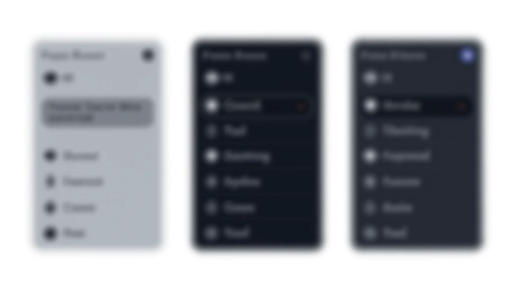
There’s no single “right” way to design a theme toggle, but there are patterns that work better than others. The switch toggle (like iOS) is familiar and compact. It’s perfect for navigation headers where space is limited. Alternatively, button pairs (Light / Dark) give more breathing room and feel more explicit. We’ve seen both approaches succeed depending on context.
What matters more than the visual style is clarity and feedback. Your toggle needs to:
Icon choice matters here. A sun/moon pair is intuitive but overused. Some teams use custom icons that match their brand better. Whatever you choose, ensure the icons work in both light and dark contexts. A dark icon might disappear on a dark background — that’s where testing with the actual implementation beats mockups.

The design is half the battle. Implementation determines whether users actually trust your toggle. You need to store the user’s preference — localStorage is the standard approach. When someone clicks your toggle, you’re not just changing styles for the current session. You’re saving that preference so it persists across visits.
Here’s the workflow that works: Check for a stored preference first. If none exists, respect the system preference using `prefers-color-scheme` media query. Then let users override that. This respects user intent at three levels. We’ve found this approach eliminates the jarring “flash of wrong theme” that happens on page load when you ignore system preferences.
CSS custom properties (variables) make implementation cleaner. Define your entire color palette as variables scoped to a theme class. Then switching themes is just changing which class is applied to the root element. No cascading color changes. No specificity battles. Just predictable, manageable styling.
Pro tip: Use a small debounce on your toggle handler (100-200ms). Prevents accidental double-clicks from causing flicker. Users barely notice the delay, but they notice the stability.
Icons are where most theme implementations fall apart. A simple color swap doesn’t always work. A thin-stroke moon icon that looks good on a light background might become illegible on dark. Stroke weights, fill opacity, and overall weight need adjusting across themes.
We’ve tested this extensively: icons designed for light mode at 2px stroke width often need 2.5px in dark mode to maintain visual balance. This isn’t about perfection — it’s about legibility at actual usage sizes. A 16x16px icon on a smartphone is where real users interact with your interface.
Test every icon in both modes at actual viewport sizes, not just in design mockups. What looks fine at 64x64px might fail at 16x16px.
Colored icons might not adapt well to both themes. Monochromatic icons with good contrast are more reliable across theme changes.
Stroke width might need tweaking between themes. A 2px stroke in light mode could become 2.5px in dark mode for equal visual weight.
Modern operating systems have accessibility features built in. Windows, macOS, iOS, and Android all let users set system-wide theme preferences. Ignoring these is a mistake. If someone has their phone set to dark mode for accessibility reasons, your light-mode-only interface is creating friction.
The `prefers-color-scheme` media query (supported in all modern browsers since 2020) lets you detect these preferences. Use it as your baseline. Then overlay user choice on top. This creates a hierarchy: system preference as default, user toggle as override.
One detail most teams miss: what happens when users change their system preference while your app is open? The best implementations listen to the `prefers-color-scheme-change` event and update accordingly. Users don’t expect their app to be out of sync with their system settings.
“The difference between a good theme implementation and a great one is respecting what users have already told their operating system about their preferences.”
Testing isn’t a final step — it’s embedded throughout. Start with contrast testing tools during design. Then move to actual device testing during development. This isn’t about pixel-perfect matching between light and dark. It’s about ensuring every element remains readable and functional in both modes.
Use WCAG Contrast Checker or WebAIM tools on every color combination. Don’t rely on visual judgment alone.
Test on actual devices with different screen types. OLED screens render dark mode differently than LCD. Real-world conditions matter.
Clear cookies and localStorage, toggle the theme, close the browser, reopen it. Does your preference persist? Test across multiple browsers.
Test system preference changes, rapid toggling, localStorage disabled, different browsers. Real users will find edge cases you didn’t anticipate.
Effective theme toggles aren’t complicated. They’re just thoughtful. Start with solid contrast ratios. Choose a toggle pattern that fits your interface. Implement persistence properly. Adapt your icons. Respect system preferences. Test thoroughly.
The best implementations are invisible to users — they work so naturally that people don’t think about them. The toggle just… works. Your preference sticks. The interface remains readable in both modes. Icons look crisp. That’s what we’re aiming for.
Start with these foundations, iterate based on real usage, and you’ll build toggles that users actually appreciate instead of tolerate.
This article provides educational information about theme toggle design patterns and best practices. The techniques and approaches described are based on current web standards and accessibility guidelines (WCAG 2.1). Implementation requirements may vary depending on your specific project, user base, and technical constraints. Always test your implementations thoroughly with real users and accessibility tools. Browser support varies for CSS custom properties and the `prefers-color-scheme` media query — verify compatibility with your target audience’s browsers before deploying. This content is informational and not a substitute for professional design consultation on complex projects.
Learn how WCAG standards ensure your designs are readable for everyone. We break down the math, testing tools, and common mistakes.
Read Article
Icons need more than color swaps. Discover weight adjustments, stroke width considerations, and testing approaches that work.
Read Article
Building a color system that works in both modes requires planning. Learn the architecture that scales without chaos.
Read Article