What We Offer
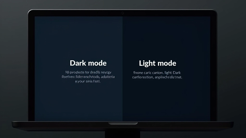
Practical guidance on implementing accessible dual-theme systems that work across Malaysia’s diverse user base and device environments.
Dual-Theme Design System Creation
We build foundational color systems that work seamlessly in both light and dark modes. Your design team gets a documented system showing exactly how each color transforms between themes, with specific hex values, semantic naming conventions, and a component library ready to implement.
WCAG Contrast Ratio Optimization
Accessibility compliance isn’t negotiable in Malaysia’s regulated digital environment. We audit your interface for WCAG AA standards across both themes, test every color combination systematically, and provide a contrast matrix so your team can maintain standards as you evolve.
User Preference & Toggle Implementation
Theme selection should respect user choice. We design and document preference toggles, system preference detection, and persistent storage patterns that work across web, mobile, and progressive web apps. Includes code examples in React, Vue, and vanilla JavaScript.
Icon Adaptation & Asset Management
Icons that look good in light mode often fail in dark mode. We establish icon design principles specific to dual-theme environments, create adaptation guidelines for your existing icon library, and set up a system for managing SVG fills, strokes, and opacity across themes.
Ready to implement dual themes?
Let’s talk about your current interface and what a proper theme system could do for your users.